HR Analytics
August 25, 2022
How To Communicate HR Analytics Findings To Leaders And Other Stakeholders
A data-savvy organization is a great thing to be a part of. You can get to the root of an issue in record time and use your analysis to take informed action.
That's exactly what we should strive for with our decision making, particularly when presenting those findings to decision makers that aren't as data-literate as you are.
But what if there was a gap in the data literacy of everyone involved? And how can you get your message across even then?
Here are five ways to help you talk through your data and explain your findings.
1. Involve stakeholders early in the process
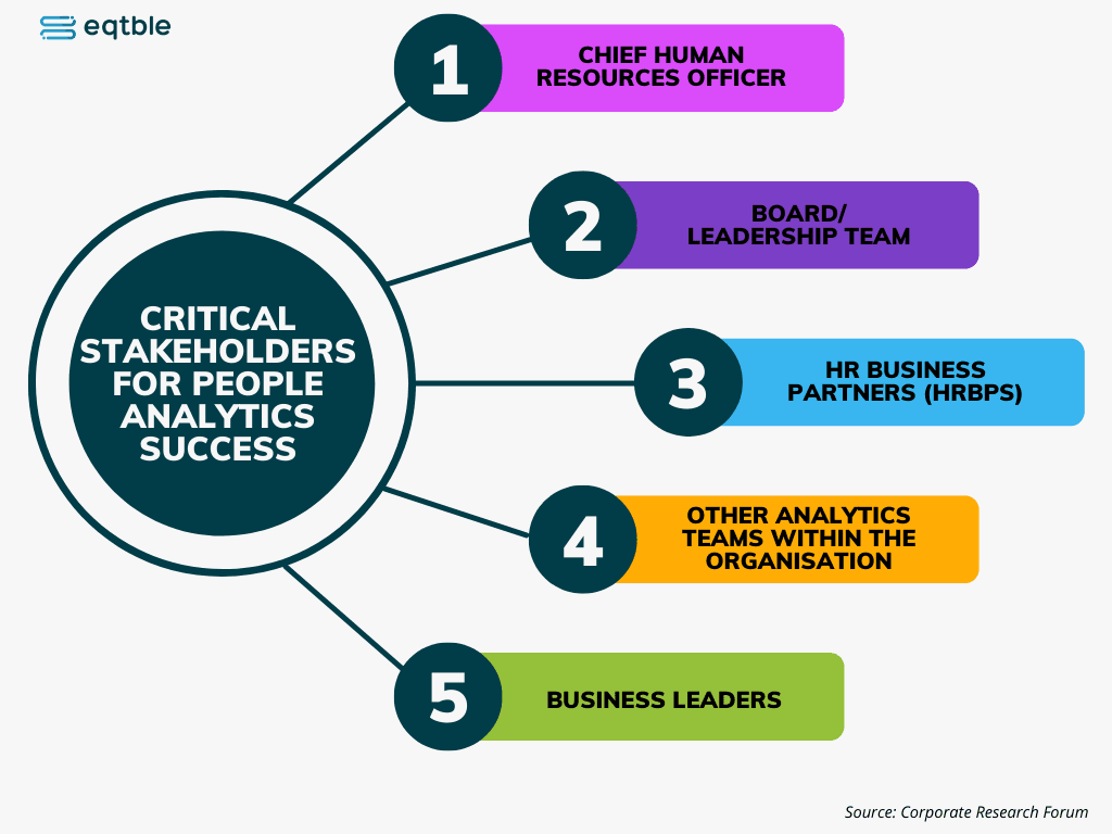
If possible, involve stakeholders early in the process so they can become familiar with what you’re working on and how it fits into their needs.
If you don’t have this opportunity, explain why it’s important for them to understand your findings as soon as possible after presenting them.
This will prepare them to understand their role in addressing issues identified through analytics and prepare them for any changes that may result from the insights.
2. Use visuals that ‘non-data inclined’ people understand
Visuals are a great way to communicate your findings and explain the story behind your data.
If you have access to an audience that is not savvy with numbers, then you need to use visuals that they can understand.
The best way to do this is by using visuals that show relationships between concepts or ideas. But with traditional HR dashboards, you don't get the full picture.
They are usually not user-friendly and are filled with confusing charts and graphs that require data expertise to decipher.
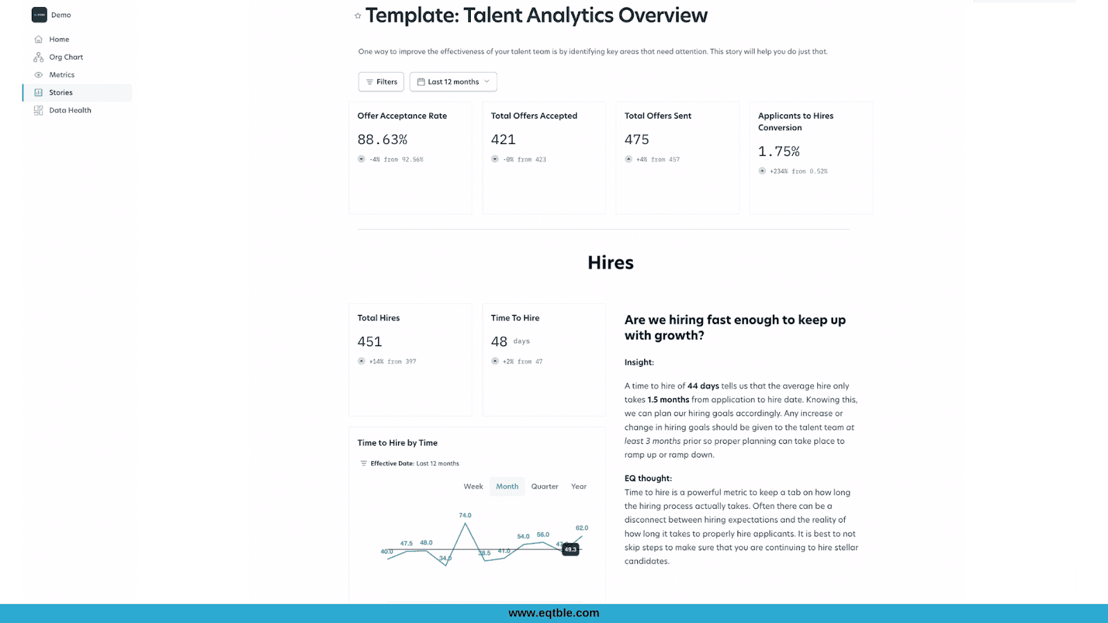
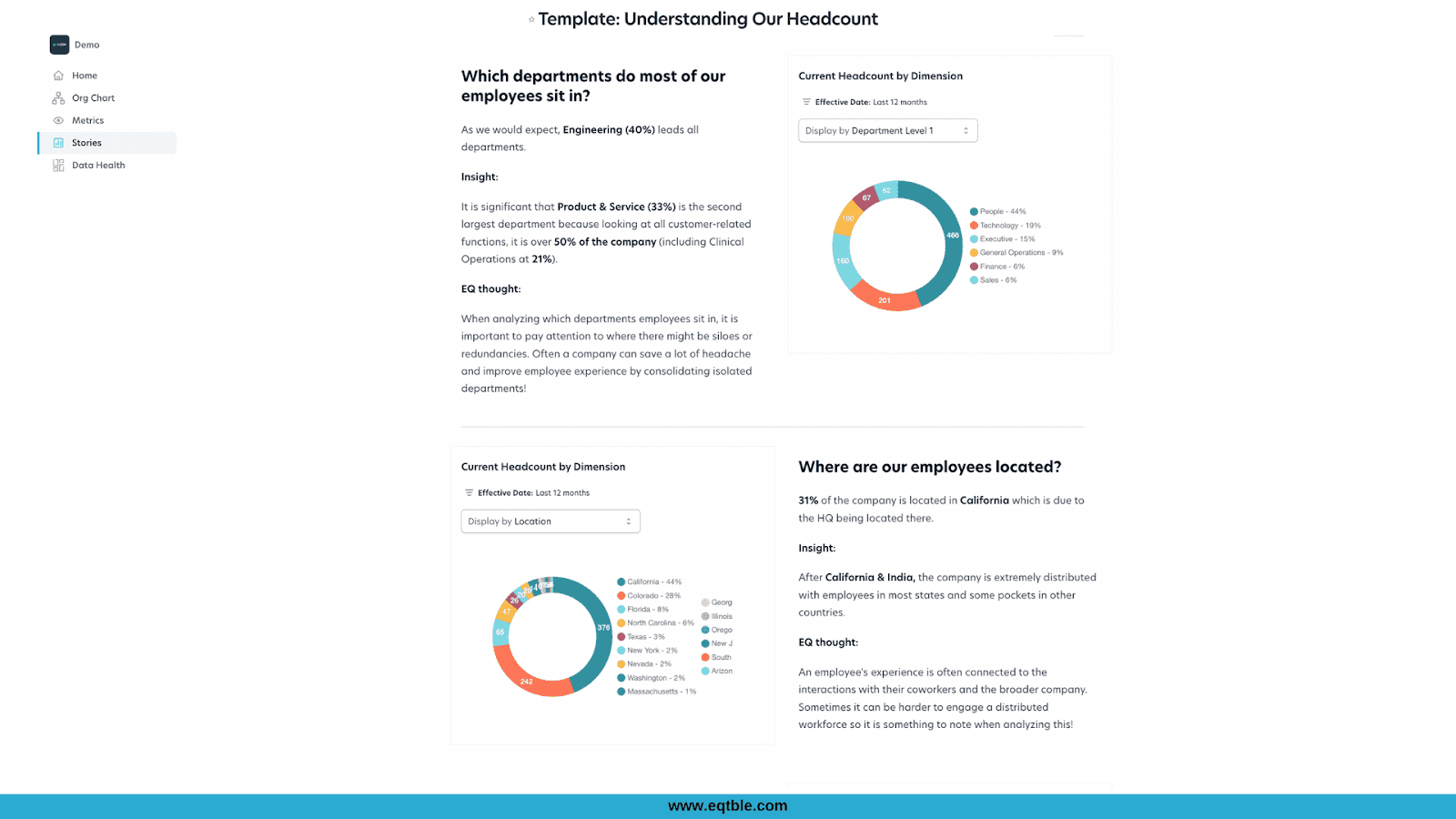
What if you could generate insights from your people data that are simple enough for non-data inclined people to understand but still kept all of the valuable information intact? With eqtble, you can! See the example below.
3. Provide context
Data literacy is about more than just being able to read a chart; it's about understanding what the numbers mean and how they relate to each other.
When discussing your findings with others, always provide context for what you're showing them. What does this mean for our business? Why is this interesting? How does this affect our strategy?
These questions will enable your audience to see the value of what you've done and motivate them to explore further on their own.
Read case study: How Nuro simplified their analytics and unified their sources with eqtble
4. Prioritize the stats that matter most
Before you start crunching numbers, make sure you know what's important and what isn't.
This means taking an inventory of the metrics that drive your business and determining how much weight those metrics carry in terms of decision-making.
The most common mistake HR professionals make when presenting reports is to include all their findings in one report.
This often leads to an overwhelming amount of data that can be difficult for most people to understand.
For example, let's say you're working on a project with five objectives: attracting candidates, improving employee retention, reducing training costs, increasing productivity and improving diversity.
You may want to present all five of these objectives as part of your findings report, but this can leave people confused about what they should focus on first. To improve communication and increase the impact of your report:
Focus on one objective per report
Choose one objective and focus on showing how it relates to other objectives
Show how each objective links back to key business metrics
5. Don’t overwhelm them with technical jargon
To be effective when presenting your HR reports, you have to ensure that your audience understands what you're presenting and why.
You must ensure that they see the issue through the same lens as you.
To frame your data correctly, you need to know what the key points are. These points can be drawn from any source, including the data itself or other experts who have been looking at it for longer than you have.
You then want to find a strong narrative that illustrates these points so that you can explain them clearly and effectively to your boss or colleagues who don't have as much experience with these numbers as you do.
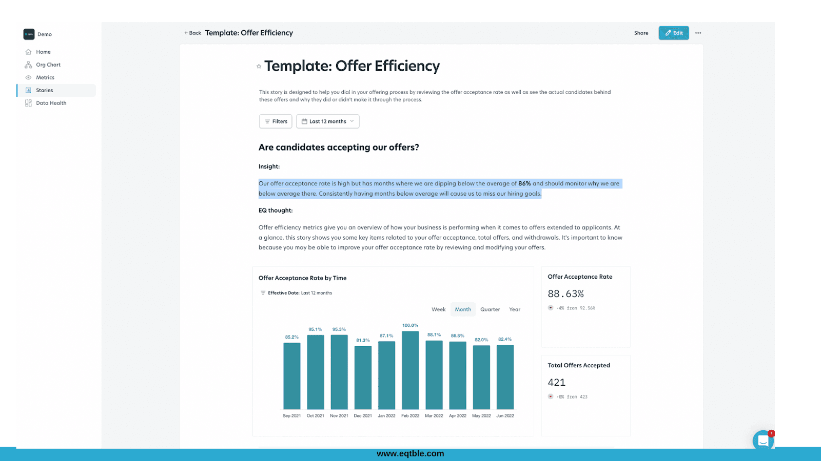
In the example below, the key point of the report is that even though the offer acceptance rate is high, there are months when they've fallen short, and if they don't investigate why that's happening, they might miss their hiring goals.
The charts and graphs are great, but without highlighting what you want your audience to focus on, they might not understand why this is an important issue.
